Friday 9 December 2011

Audience Feedback

Having chosen to resubmit my coursework it was highlighted that there was little attempt at gaining audience feedback. I have created this post to demonstrate what we did as we did not emphasise it the first time.


YouTube:
We uploaded our storyboard to my youtube account to see if we could get any feedback before the shoot but the video did not gain a lot of views or any comments.


I also posted the first and second edit of the music video to see if any improvements could be highlighted but the only comment recieved was very negative and not helpful.


Although we didn't upload the final version of the music video the 2nd edit was close enough to the final one. One shot of the radio is in black and white in the final version. I think it is interesting to see how the video has developed from not having a narrative to having one throughout.


Tumblr:
I posted on my tumblr the before and after versions of both the DVD cover and the magazine advert. I recieved a few comments which were positive and I was glad to actually recieve some feedback.


Large group viewing:
We showed the rough edit of the music video to our media class to gain some feedback and they said that the video does say Motown. The negatives highlighted were that the video does not cut to the beat, not enough shot variation and the lip syncing needs improving. 
We also had a group feedback about our DVD cover, the picture below shows the notes that I took as the feedback was being given.
Some of the main comments were:
 - the tripod in the background makes it look like a homemade video, not professional.
- red dresses suggests sexiness, giving people a reason to hire them
- using a shot of their back was effective because it draws the audience away from their appearance. Motown is generally associated with black singers and so the shot of their back takes away the impact of their skin colour.
- Some said that the logo on the front made it look like a sing along DVD
- The DVD cover was unconventional but it ultimately suggested Motown.


The resubmitted DVD cover and magazine ad was not shown in a large group capacity but they were shown to various different people throughout the stages of recreating them to ensure they said 'Motown', although the feedback recieved was not as in depth as the above, it was still useful and the large group feedback aided the recreation as I avoided and changed a few of the negative aspects highlighted.

Saturday 26 November 2011

Resubmitting Coursework - DVD Cover

In order to improve my overall grade I have decided to resubmit my coursework

DVD Cover


Before:

After:

The audience feedback that I received concerning the first version of the DVD cover highlighted several issues  with the cover that did not resemble Motown. For example the front cover may feature the three lead singers of the band (very conventional to Motown) yet the rest of the picture presents an unprofessional aspect to the overall look; such as the tripod, school dinner tables and picture frames on the walls. Audience feedback also suggested that although the singers themselves do represent Motown, the background of the front cover portrays an 'amateur and homemade' feel. With this in mind I changed the front cover and used pictures that were taken on the day of filming.
The following images were found to base my new front cover on:
 

The obvious elements taken from the 'Temptations' poster are the swirling white graphics which I incorporated into a sheet music stave and ensured the swirls were more feminine and musically orientated, I downloaded some Photoshop CS5 brushes to help with this and also used clip art images of musical notes etc. Some lines were created by using the paint brush tool and changing the thickness of the brush whilst using the tool. 
The elements I have used from the picture on the right is the band of images, whereas they are all marked with a border, I decided to use the gradient tool within Photoshop to add a blurred effect so the pictures of my band blend with the black background. This creates a more professional behind the scenes look to the band, contrasting to the first submitted DVD cover.

Attempt 1:


To start with I used pink/ red tinges in order to make the cover look more feminine however feedback suggested that the cover was more pink than red and therefore did not signify Motown, with this in mind you can see how I changed the colour scheme prominently to red which I believe works a lot better.
I initially kept the microphone picture blue, but then this again did not look aesthetically pleasing as it constrasted from the red, therefore hindering the Motown influence. The final colour scheme adds a dated, classic look to the cover yet the swirls are more modern and feminine which attributes the band to appeal to a modern audience which is what the band had wanted.
As you can see from the 'attempt 1' picture that there are significantly more swirls and also some artistic dots added, having discussed my DVD cover with someone that is more familiar with the Motown era, he highlighted how advanced use of graphics such as that would not have been easily to accomplish so I significantly simplified the swirls and we agreed that it links very well with the 'Temptations' poster swirls.
I also changed the rating logo as I used the American one instead of the European one.

The colour red was used do to it significantly linking to the music video we created. The three singers wear bright red dresses which would become their iconic image and therefore it makes sense to create the accompanying media with the same colour schemes as the outfits. As the band becomes more known to the public it would create a house style and recognizable image which the audiences can connect with and identify with the band.

Research
Additional research involved using the 'Classic Motown' website in order to find authentic advertising media for Motown bands. I looked more into the conventions of the texts and drew that colour overlays are frequently used. 
Seeing as it is difficult to determine authentic posters from modern representations I decided to look into Motown tribute bands to see if i could gather inspiration and find more conventions.
The following are interesting posters that use the colour overlays and also a wide range of pictures of the band which is why I decided to use pictures of the instrument players as well as the singers in my re-submission.


The above pictures all have a common theme where they have the different images blurred along the lines, this I have decided to replicate within my DVD cover. The third picture has obvious Motown conventions due to the microphone and classic Tamla Motown CD in the background, it was suggested that I should be obvious in my usage of conventions and decided to use a clip art picture of a record and a vector image of microphones.

Tuesday 10 May 2011

CD Cover

This was created as an extra piece of media which would be used as the CD sticker on the DVD. There was only one hour to create this in lesson time as we were told that the DVD were being burned that day, because of this, I took the role of creating it as it would be quicker for me as opposed to someone else in the group.
Max wanted me to darken the background as the school chairs and dinner tables could be seen, which looked childish and unprofessional, I then removed all of the emergency exit signs and there was also tripod visible on the left in the hall but I chose to remove it to retain symmetry in the image. As there was no symmetry seen with the lights I added four more lights and added a lens flare in the middle and attempted a slight glow/ silhouette effect around the girls. The red of the dresses was also increased and the ladies themselves were particularly lightened as the image was very dark.
The editing did not take too long and I only overrun into lunch by about 10 minutes. Most of the time consumption was in the removal of the tripod and the highlight/ lightening and darkening process.

Final Magazine Advert

Our magazine advert was a replication of a poster that Max luckily found to be from the Motown era. It is an effective replication and it follows the original poster closely.
Max had the responsibility with Molly to create the poster but it was largely created in the mutual frees Max and I had. I was editing the DVD cover by the side of Max while he was editing the cover and this turned out to be a good idea as I could offer my knowledge of photoshop so Max could find certain tools quickly, saving time.

Final DVD Cover

The final DVD cover took a while to finish as it was difficult to find a suitable image as many of them were unattractive and unflattering pictures. However I found this picture to be particularly interesting due to the unusual angle that was inspired by DreamGirls:
Due to the camera being behind The Harmonettes singers it connotes the idea of the audience being on stage with the band and a part of the process and a 'candid' moment is created.
It was difficult to source any actual Motown era material but found the following few images to be of interest, but our DVD does not specifically replicate any elements from it:


As there are no actual Motown creations of DVDs our DVD cover is essentially an original idea. The use of the 60's style microphone was a key advertising ploy to those who are a fan of that era of music but also indicates to the audience what is within the DVD, this is also described in the short blurb.

I edited this cover completely on my own, and had suggestions from Max but due to the deadlines needing to be reached, I ensured I edited in my frees and lunch times when I could (I couldn't do a lot of editing at home as my free trial of photoshop run out) and eventually got it done. I edited the saturation of the red dresses, increased the lens flare, added the logo and band name and sharpened the girls themselves. Max suggested getting rid of the tripod in the background and so I attempted this however is was very difficult and looked better with it in. The microphone on the back cover was a picture that was previously in colour and so I added a cooling effect over and over again until it the colour eventually replicated the blue near the lens flare and the lens flare behind the microphone a the bottom had a red tinge to represent the dresses. Exempt from certification logos were added as well as the DVD logo and a bar code which fits the conventions of having a transparent background so the image behind can be seen, I ensured I replicated this.

Editing - Narrative

Due to filming the narrative on the Friday and the deadline for the music videos being on the Monday, I decided to take the full editing process upon myself.
I downloaded a trial version of adobe premiere in order for me to edit the narrative into the music video over this weekend.
I encountered several problems due to the trial version not supporting certain the specific format of video which the footage was in, I tried to figure out a way round this and any conversion software did not work. I decided to import the footage individually into Windows Movie Maker and save the file as a .AVI file whereas the footage from previously in .MPEG (I think, I cannot specifically remember) this enabled me to import the files into premiere and no other importing issues were faced.
In order to appear like the song was being played through the radio I thought that a voice introducing the song would be key, and so luckily I found a willing participant, (my online friend Calum) who was able to record the line 'And coming up next on late night FM, The Shoop Shoop Song by the Harmonettes'. Calum has a strong Liverpool accent and so it was an entertaining process trying to get him to tone it down a little due to audience being able to understand as well as a Liverpool accent not being identifiable to Motown.

It had previously been discussed the possibilities of having a black and white music video, but when experimenting, I thought it made the video look dull and the red dresses made the video stand out more than it would have done if it was in black and white so I decided to keep the music video in colour, but edit the narrative in black and white. This again represents the narrative to be set in the past whereas the colour performance is a modern day representation and the younger selves have grown up with the song. We noted that in Girls Aloud - The Promise the performance was in black and white whereas the narrative was in colour, our video juxtaposes this one and it was where our idea of using black and white came from.
Other regularly seen themes in music videos is the fade appearance of the band name, song name etc coming up at the beginning of the music video and so I decided to add this when the song starts after it is turned up on the radio. I did this my remembering the previous process of adding band members names to the Behind the scenes documentary and so this as a quick addition this time round.
I also edited any other lighting issues that were existing and tried to iron out anymore flaws.
Due to the original first shot seen of the singer singing the first line being out of sync, I changed it completely to show the keyboard player first as it is a key part in the music where the keyboard is heard distinctly and so it made sense to include it. This erased any drastic syncing issues as it was largely the main part out of sync, however still due to the lead singers inability to mime, parts of the song still look dodgy.
On Monday I showed Max and a small group of people to see of their approval and they said it was significantly different to when they were saw it and said that it was a positive improvement. I also got someone that does music technology and has extensive knowledge of sound and recording in order to see if the syncing can be improved however we found this difficult as it meant that certain parts would have to be cut out which would make the visuals inconsistent. For example, the line 'oh no that's just his charms' should be seen being sung by the singer, whereas if we edited the syncing any further the word 'charms' would not be sung and the shot would cut at an odd place and so for these reasons it was the better option to leave it as it is.

Filming Day - Narrative

Having no problems with timings and meeting up with people, we could arrive at my house as planned. Max and I soon arranged my room to be suitable for the narrative, placing vinyls and make up deliberately in certain places.
Afterwards I helped with hair and we soon got filming, I took charge of the camera whilst Max took the director role however shared the process of agreeing camera angles and shots which had to be improvised due to my room being small and having slanted ceilings meaning the access as restricted.
There were some difficulties trying to style one persons hair which resulted in her wearing a hair towel however this added to the Motown theme as it looked quite old fashioned as well as portraying the 'girls night in theme'.
Below are pictures taken from the shoot:


Despite Molly and Zoe being previously made aware of the shoot, they did not come, which was not a hindrance and was probably beneficial as not everyone would of been able to fit in my room. As Max and myself only had each other to discuss things with, the process of getting the shots we wanted were quicker.

Editing - Behind the Scenes

As all footage from the main filming and the behind the scenes filming has been transferred to the computers, the editing was quickly ensued.
We split into two groups, Max and Zoe who were to focus on editing the main music video together whereas Molly and myself were to focus on the behind the scenes documentary. This would hopefully ensure both products are edited within the internal deadline.

The process of editing the behind the scenes footage was very time consuming and a little worrying as looking at the interview of the singers, there was not a lot of worth while footage. I didn't think it was a good portrayal in the interview to show one of the singers to be eating in the background, it didn't look professional which could have given the wrong impression to the viewers.
Having watched some behind the scenes interviews from films as well as music videos I found that whoever is being interviewed, their name usually fades into view as well as their role within the production and so I decided to use this in our documentary. I asked Mr Sheppard for help in how to do this as I was unsure and then I was able to create the text for each person that appears. I had several problems were if I tried to create a new text with a different name then it would overwrite all the others to have that person's name and role and eventually figured out how to correct this.
I also decided to include the song quietly playing throughout the documentary and faded the song to silence when certain shots that included the band playing their repetoire of songs. This would advertise the band to play not just one song and could influence employers to hire them.
I wanted the documentary to have a sort of introduction and so used the promotional stills consisting of individual medium close ups of the three singers, showed each one in turn with fades between them and then finally displaying a three shot of the singers with the band name. I feel this introduces the band and the idea that the video is a documentary as opposed to another music video.

Narrative Production Schedule

A very simple production schedule was created as we had little time and there were no need to extensive details of the location and timings as Max and myself have planned to drive the cast to the location and then take them home so there will be no issues of late arrivals, or one person not turning up etc.
The schedule can be seen here:

We gave the production schedules personally to each member of the cast, and Max notified Molly and Zoe via text of the shoot a few days before the planned recording date. Molly said she could not make it and we received no response from Zoe so we found her at school to ask her if she was coming or not.
Max and I also created a facebook message together to ensure they knew about it and remembered, even though they had a production schedule, we wanted to make sure.

Narrative Planning

We only had a short time to come up with an idea for the narrative and Max firstly started with the idea of the music video being watched on a TV by a group of people who are excited at the song, the band and wish for it to be turned up, this creates the idea of The Harmonettes being a hugely successful and popular band.

The inspiration for this idea came from Outkast - Hey ya, we had knowledge of this video previously from researching Motown conventions. The film Hairspray was included in researching our narrative idea as there is frequent shots that show the dancers in the film studio being watched on TV by an audience. 'The Nicest Kids in Town' seen below is a specific section taken from the film which shows the cheesy happy reactions which we would like to emulate.


These examples are effective and I like that the attention to detail mise-en-scene is detailed and iconic which is something I would like to have in our narrative however realistically with the time frame and budget, it is unfeasible. Both videos have the elements of being watched where a TV is used showing part of the production process in the Outkast video and the audience is then brought into it by cutting to the actual performance. This is again seen in Hairspray where the Corny Collins show is being watched by two fans who are excited to watch it and frequent cutting to their reaction and the dancing performance is seen.

Max and I set ourselves to trying to source iconic props which included an old style TV, costumes, magazines or posters etc. It was difficult to find a TV and so we developed our idea to a group of girls in their bedroom, listening to music, trying to find a vinyl record to play but The Shoop Shoop song comes on the radio to which they get excited and turn it up. The theme of this narrative is a 'girls night in' and we will portray this by having the girls dressed in PJ's whilst doing each others hair and having a good time. We plan to use the narrative as an introduction to the song and video.
Max was able to borrow a real 60's radio from the era and so this was a vintage real prop, I was also able to get some vinyl records to which we put them in an old box. Max also was able to find some books and magazines which were also from the times and so we had enough props that would suggest the 60's.
We then chose the people who would appear in the video to seemingly portray the younger selves of the three lead singers in the band, this was due to choosing actors that had the same colour hair as the singers which worked effectively in portraying this.
With this idea it then suggests that as the younger selves have grown up, they have grown to love the song that much that they decide to perform it and make it their own which is positive for the audience to see as they too may have grown with the song and can empathise with this.

Editing - Music Video

As producer of the group, I decided to look at the music video during one of my frees and noticed that the video was by far unfinished and there were large syncing issues. The band representative came in to school to view the rough edit however there was very little to show him, he mentioned there should be improvements made in terms of the guitar solo and said that there is a kind of musical conversation between the guitar and the keyboard and so more shots of the keyboard should be used. Following this feedback I decided to look through all of the footage and it became clear that better shots could have been used for the existing guitar shots and so I substituted them accordingly and added shots of the keyboard player as requested.
The significant syncing issues were difficult to solve and I had to get Mr Sheppard to help, once he synced one layer of the video, it would be easy to sync other layers to that specific clip and over lay the layers when we want the shot to cut. He mentioned after he was finished helping that the syncing issues are largely because of the lead singers inability to keep in time with the song and is not something we can help as there are no other suitable shots. This was obviously frustrating and very time consuming to get the rest in sync.
As the video was not finished, there were large portions of shots yet to be added together, so a large portion of time was taken to try and sift through all footage to find the best shots.
Max had his story board and shot list to hand as he sat with me in many of our frees whilst I was editing which we referred to for ideas but did could not stick to it completely due to some footage not being suitable enough.
The video was also shown to the media class in order to gain more feedback, they said that the shot stays too long on a close up of the lead singers, we were already aware of this as we were still in the process of correcting what another member of the group had done, but noted it and made it the main priority for when I edited again. They also mentioned that some of the shots are too dark and so to correct this I edited the exposure of the clips, this was another time consuming process as each shot had to be individually corrected.
Before we showed it to the class we decided to change the opening shots to a medium long three shot of the singers as opposed to starting with the extreme close up of the lead who misses the start every time. The media class they liked this shot but there was perhaps too much head room in the framing of it, I agreed adjusted the size of the clip when I next edited. They said that they got the Motown feel of the video which indicates which we have been correct in Mise-en-Scene and reputation, they also mentioned there is a good variation in shots however the main issue is the syncing.
The long process was eventually finished although not completely satisfied with how it looked due to the out of time lead singer, it would have to suffice and Mr Sheppard agreed that it had been a significant improvement.
We discussed what level the video was worth now we had finished it and he mentioned that as it is now it would probably be a level 3, and he also mentioned that Miss Smith (our other media teacher) said that it lacked that bit extra to push it into level 4. We asked what we needed to do to push our video into a level 4 and she said that a narrative would significantly boost our grade.
As a group we had previously mentioned creating a narrative but the band representative said they wanted a pure performance video which stopped the process of any narrative development. Max and I wanted to boost the grade and so we decided to start planning a narrative and only had a short time to do it. We benefited from our previous research as we had good knowledge of Motown conventions.

Filming Day - Strengths and Weaknesses

Strengths:
- We were well prepared due to Max's detailed storyboard and shot list
- We were able to communicate well with each other in the group on the day
- There was loads of footage and more recorded
- It was beneficial that someone outside of the group was dedicated to filming the behind the scenes footage as it allowed all group members to appear in the footage so we are all seen being productive.
- Various shot lengths and angles were filmed
- When there was a spare camera I was able to try and be creative with some shots and experiment a little.

Weaknesses:
- Communicating that we wanted the band to be quiet during the set up of shots would have been better.
- More time was required to do the photoshoot - although not our fault if we worked more efficiently earlier in the shoot we could have avoided this.
- Some shots took a lot longer to get, one in particular was the close up of the lead singer, she kept missing her start of the song which made her out of sync slightly (given the song was difficult to mime to as there is no instrumental part at the beginning).

The difference between this shoot and previous productions such as AS and preliminary tasks is the fact that I have learned to be well prepared and back up ideas with research, whereas throughout AS it was evident there is significantly less research than I did this year, meaning I can justify my chosen representation methods and things which conform to conventions. I have also improved my team work skills and have had help and given help and suggestions in what to include in the shot lists, discussion of what to include in the video etc. I feel the shoot went well despite not being 100% into it and passionate about the band, appearance, song and genre.

DVD Cover Research

I have been researching and looking at different music based DVD covers, it is fairly difficult to find them. It is important to research the conventions and themes in music DVD covers as to ensure our own DVD cover will look professional and appropriate.


This DVD marks the return and reformation of Take That in 2006 and features footage of their long awaited tour. The construction of the DVD is clever is the name of the band is centre to the front page and the picture of them slightly smaller, this creates the idea of the brand 'Take That' being able to speak for itself and there is little need for the band to be seen as it is so well established; this is also evident on the back where their faces are not seen at all. The large 'disco ball' appearing on the front page has worldly or planet connotations as it is large, which links with this title of the album of Take That. It is a frequent convention seen on the back cover to see any logos to have a transparent template so it fits in with the colour of the background. The DVD logo for example will always appear white, but the holes between the D etc will always appear as the background colour, this is similar to all other logos and text on the back of the DVD.


This DVD cover is taken from Avril Lavigne's earlier career and easily establishes her as a rock/ artists due to the black and white, also adding an edgy element, other things that suggest rock are the sweat bands and the textured star graphic. The 15 rated certificate also is cause for notice as it has explicit content, much like many other rock/ metal band DVD's such as Slipknot. The bold, large red font stands out from the background however I think the paleness of her skin and her pose takes most of the attention. The text needs to large in order to establish her name so people can identify her appearance with the name. There are pictures used from her live performances which advertises what is contained on the DVD, showing what the audience is to expect. The conventional transparent logos are again seen on the background.


The font on this DVD cover is particularly unconventional and usually not identifiable to Robbie Williams, this is not a music DVD but more of a documentary into his life, indicated by 'His Story' which suggests he has gained negative press and wishes to justify himself through the documentary format. The font would be conventional to rock music due to the scratchy appear of it but as Robbie Williams is established as a well known artists it is acceptable for him to have an irrelevant font; on the other hand it may be relevant to his lifestyle and previous drug taking etc and so in this sense it is completely relevant. As seen on the Take That cover the logos etc all have transparent backgrounds and so it seems to be a regular occurring theme. Another common feature I have noticed is the use of pictures from live performances are usually included on the covers, evident in this one and in the Take That one.

This cover uses pictures from live performances again and is very simple, clear and identifiable to the swing and big band genre of music due to the suit Robbie Williams is wearing and also the large wall of lights; his pose and facial expression is also portraying the genre. The small thin font suggests elegance and 'posh' which is another convention of swing and big band era of music.


This cover for Beyonce is from her earlier work and so the picture does not use images from a live performance as she is not as well established in these years as opposed to Take That and Robbie Williams being well established at the point of creating their DVD. It is important for this to use a photoshoot picture of Beyonce to advertise her at her best and also to ensure she is recognised, any stage location or background may cause distraction for the viewers, so the white plain background allows all focus on Beyonce however the disco ball presents an interesting object that would make viewers look at the picture more. (I couldnt find a picture with both the front and back cover)

Behind The Scenes Research

Behind the scenes documentaries are an effective way of gaining more fans or increasing sales as it gives a background insight into the lives of stars. I think it is clever how they are made as it portrays the cast and crew on set as happy all the time, obviously it would be irrelant to include any controversies in a documentary such as this as it would not be very productive; but realistically I think it is safe to assume that due to the stressful type of production that it would not be plain sailing all the way.
The benefits of creating a 'behind the scenes documentary' include: more personal insight for exhisting fans, any assumptions/ negative media received by certain artists can be erased through their positive portrayal in the documentary. For example if an artist has a reputation to be a moody diva, they can be changed through the use of the documentary. Other benefits include: perhaps inspiring people to become involved in the media industry, documentarys may be funny or entertaining and so the audience enjoy watching it and look out for more material from the artist.
Conventions of Behind the Scenes documentarys may include the low volume embedded usage of the song that the music video is being produced for. For example in the below Taylor Smith documentary the song is quietly played while people are talking.
It is also usual to see someone start talking about a certain subject and then relevant clips and images are overlayed onto the audio; this keep the audience entertained as it could get quite boring if someone is being interviewed and shown on screen throughout with no variation.


Promotional Poster Research

This promotional poster of Avril Lavigne is effective for several reasons. As she is standing in front of a wall as opposed to have a specific location it allows all focus to be on the artist herself. The texture of the wall suggests strength and less clean cut which is typical for Avril Lavigne's past work. The logo in the top left is a modified symbol of the skull and cross bones which is identifiable to punk fashion, again something that Avril Lavgine is familiar with however turning the skull into a heart makes the logo more friendly in combination with the pink highlight it would appeal to a slightly younger than usual audience, typically female. However the black colour of the text is particularly masculine and so may appeal to the male audience more. The pink in her hair with the pink in the logo brings them together and creates a brand identity which has changed since Avril Lavigne went from the original identity of brown hair with black underneath to blonde with the pink strip and so represents a new image for the artist. The artist lacks any positive emotion in the picture and is also holding her hair however the negative connotations are juxtaposed by the pink as well as her previous reputation for being known to look un-smiley.


This Madonna poster has been inspired by the iconic Marilyn Monroe art by Andy Worhol. The poster suggests that Madonna is appealing as a sex symbol and her pose indicates strength as opposed to Marilyn's smile equalling happiness. The use of primary colours on the Madonna poster is eye catching and an effective replication of the artwork but does not wholly copy it which makes it unique. The text used is bold and large due to Madonna's well established identity and reputation within the music and media industry.

This promotional poster is interesting as it does not feature the actual band in any way, creating the idea of mystery. It also disallusions the audience to the appearance of the band and focuses on the music itself. The black and white poster is simplistic but effective as it has all the necessary details. The significance of the two porcelain dolls are questionable however other bands such as Foo Fighters, Modest Mouse, Massive Attack and Mars Volta all have weird or seemingly irrelevant items in their promotional material, I think the use of not using the actual band on the cover is effective at diverting target audience. Someone that has never seen this band would be more interested in listening to the song and not having and pre-judgements of the band due to their appearance.. The font on the poster is unconventional to the rock genre and generally you see bold, masculine, grunge effect fonts whereas this font is more feminine and simple perhaps indicating that their lead singer is female.


The above pictures were found to show the Motown influences and gain ideas for our own Poster, the themes used are talked about more explicitly in another post.

Past Work


This is an example of my past production coursework which demonstrates what I am capable of rather than the preliminary task that we had to undergo before we undertook our real coursework production. Firstly for AS I was teamed up with Max again and one other, however, the extra ended up leaving the group and the school completely. This hindered us to some extent as the extra was slowing down the production process but when Max and I were left to get things done ourselves, we worked well together and produced something we were both happy about with little dispute. I believe we were able to take on the roles that the other person had and worked effectively despite the added tasks.

As I did not do media at GCSE level, my AS year was very much a learning process and the first time I had properly used a camera or video editing software. I learned that time management is key and aiming to finish work before a deadline is key. The use of a storyboard was particularly important to our project and I also think working with another person is good when trying to create one; this is something me and Max did last year and have implemented this year. I am pleased with the overall look of the shots and as I was the female protagonist, we did test runs of the shot, both watched it back which enabled us to frame the shot better, re-position the camera if necessary and get effective shots with the limited time we had.

This year we have benefited from improved technology at the school which will help as well as having relevant workshops; this in itself has improved the skills needed in production and I believe any flaws (such as the lighting in the AS production) can be improved and the creativity can be increased. I have learned to use the people in my team to improve ideas and work before deadlines to ensure any problems encountered can be dealt with. For example, in the preliminary task of 'cut to the beat', I was producer and ensured that we filmed well before the deadline, this was beneficial as the footage got deleted off the camera, however, we then had to change our idea completely and in the end missed the deadline, the editing was then thrown together in a way which I was extremely unhappy with and last minute changes were made by a team member which I had no knowledge of and , in my opinion, ruined the video completely. From this I have learned to have more input into the final editing process to ensure continuity.


Photoshop Trial/ Test Editing

I have now downloaded the Adobe Photoshop CS5 30 day trial onto my laptop so I would be able to edit some of the photos from Sunday's 'photoshoot'. The salvageable pictures have been relatively easy to edit despite my dislike for the quality.
The stage was lit too dimly, which there was no time to correct due to being ushered out of the location, and so the photos are not correctly exposed, with this I lengthened the shutter speed slightly but not enough to pick up hand shake or movement of the girls.
I tried a range of shots however the ones that I am fairly happy with are medium close ups
As you can see below, the lighting is not consistent, especially with the third picture, however, these are only the first edits and I will try to edit the light to be more similar.
These were originally in colour however I think the pictures are more flattering in black and white. This was due to the make up worn by the girls, causing uneven skin tone, which was enhanced by the lights. Whereas the black and white balances the skin tone and allows for easier editing.

I think the pictures could have been improved by lighting them properly, using stage lights means the subject was only lit by front lights, whereas if one of us got the light certificate, the stand alone light could be set up near a window so there would be light reflected from the front and the side, and Connor would have held a light reflective sheet on the other side where there was not a light source. In professional photography it is important to correctly light the subject so that correct exposure is achieved which displays more texture and detail in all the features.


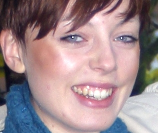
This photo is particularly incorrectly lit and exposed as the detail in the women's hair has been lost, this means that I cannot add any interesting contrast or make the photo lighter as it can make the hair quality worse. It is fairly acceptable at the minute but I aim to edit the eyes to make them stand out more in the hopes of distracting from the hair. I have removed a few lines and shadows on the nose and around the eyes as general maintenance of the image.


This photo is borderline acceptably lit, however, texture is lost in the shadowed areas near the ears and the hairline. It is also not as sharp as the picture should be, but this was due to the lengthened shutter speed to try and get more light into the photo. I have to be careful with the ‘Sharpen tool’ in Photoshop as it can make the picture too pixelated if zoomed in or printed largely.


The photo on the right has been the most problematic to edit, firstly the lady had the opposite shoulder forward, whereas the other two had the same shoulder forward. I did not have time to take more shots and so to amend this problem, I used MS Paint to 'flip the picture horizontal' which has made the image look consistent with the others. The lady also tended to squint in every photo and so I have edited her eyes slightly so they appear more open, I did this with the ‘liquify’ tool on photoshop. This picture is also quite blurry, there is no detail in the necklace and the hair.


I am already familiar with Adobe Photoshop as it used to be a pass time to just play around with photos, doing this I believe I have a good knowledge of the software and so have been confident with the ability to edit photos.
Below are some examples of how I have edited past photos in order to practice using the software:
 This photo was edited by clearing any blemishes with the 'patch' tool and also editing the shadows, light, highlights and exposure etc by pressing 'ctrl m' and 'ctrl l' (i only know the shortcuts not the name of the tool)
The colour has been saturated in the lips and the eyes have been brightened.

 This image has been edited by increasing the saturation and adding a slight warm effect. I also sharpened the person as the main focus as well as the grass in the foreground.
 This image has been severely edited and to this day has been the image that has been the most time consuming. The eye colour has been lightened with the 'dodge tool' and the pupils have been darkened with the 'burn tool' as well as the eye lashes.
The colour in the background has been significantly reduced using the 'desaturate tool'.
The skin in this picture has been the most problematic, most of the skin has been taken and replicated from a single patch as unfortunately her skin was not in good condition.


Although this picture is not the original picture to the above, I have included it to demonstrate the skin editing, colour changing etc. This picture is considerably blurry so not all the skin texture can be seen but you can see some blemishes.


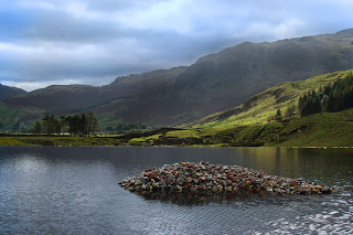
This picture has been edited by increasing the saturation of the green in the nearest looking hillside whilst desaturating the furthest away. I have also sharpened the pile of stones and increased the colours in them using the 'ctrl m' and 'ctrl l' shortcuts.


As I keep badgering on about it, my entire gallery can be seen as evidence of my Photoshop knowledge.